Byron Hamburgers
Byron Hamburgers is a British restaurant chain with a fun, quirky personality. I was brought on as a consultant to work on the brand website redesign and mainly focused on critical user journeys, information architecture and navigation styles. The aim was to create a simple and intuitive experience for the user.
Critical User Journeys
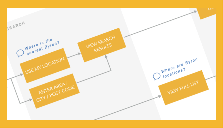
I used competitive analysis and industry best practices to map out the critical user journeys, such as making a booking, finding a restaurant or browsing the menu. I worked with the UX director to look at ways we could best serve the needs of each customer based on their context and device.
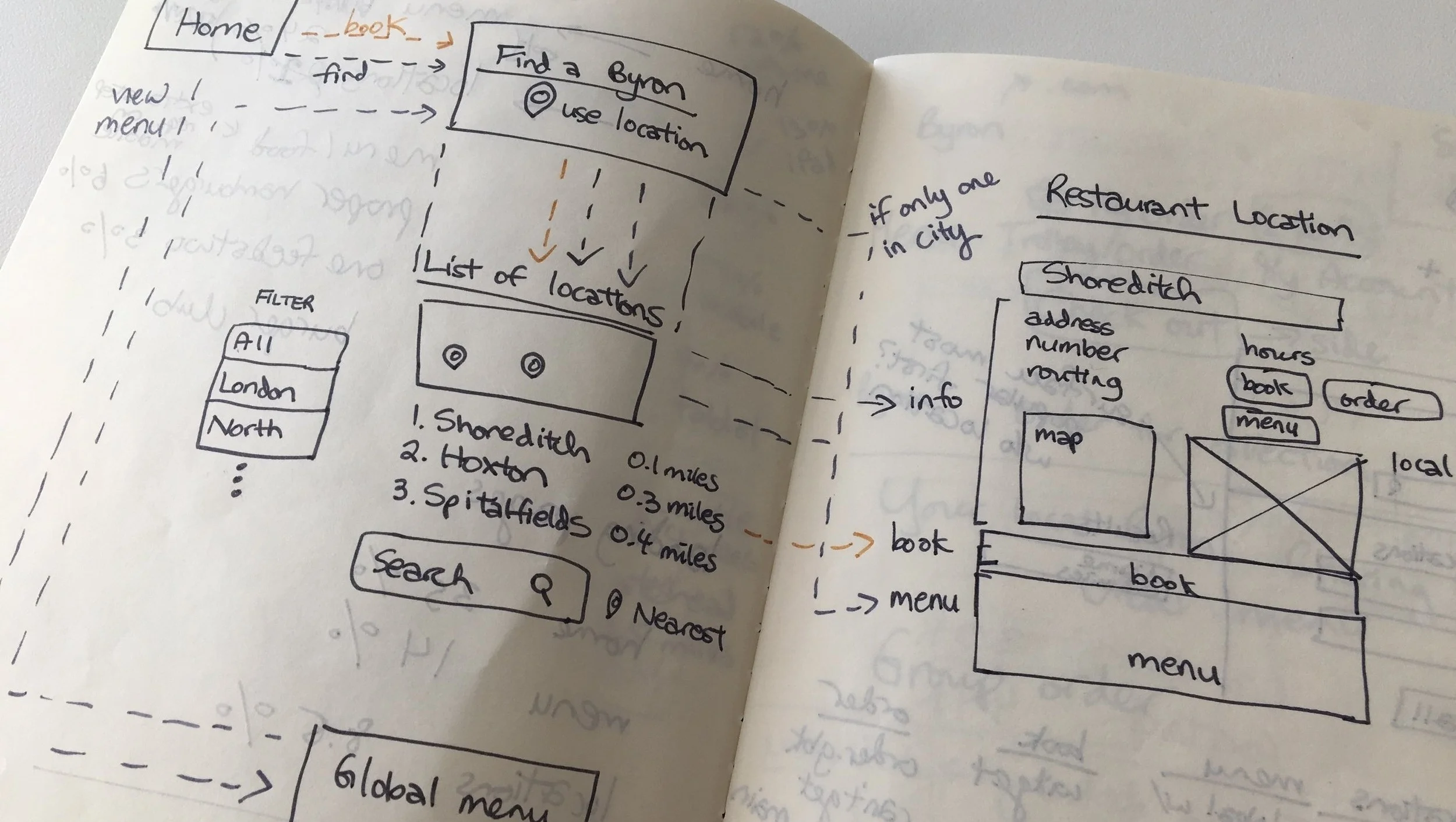
Sketching out the flow
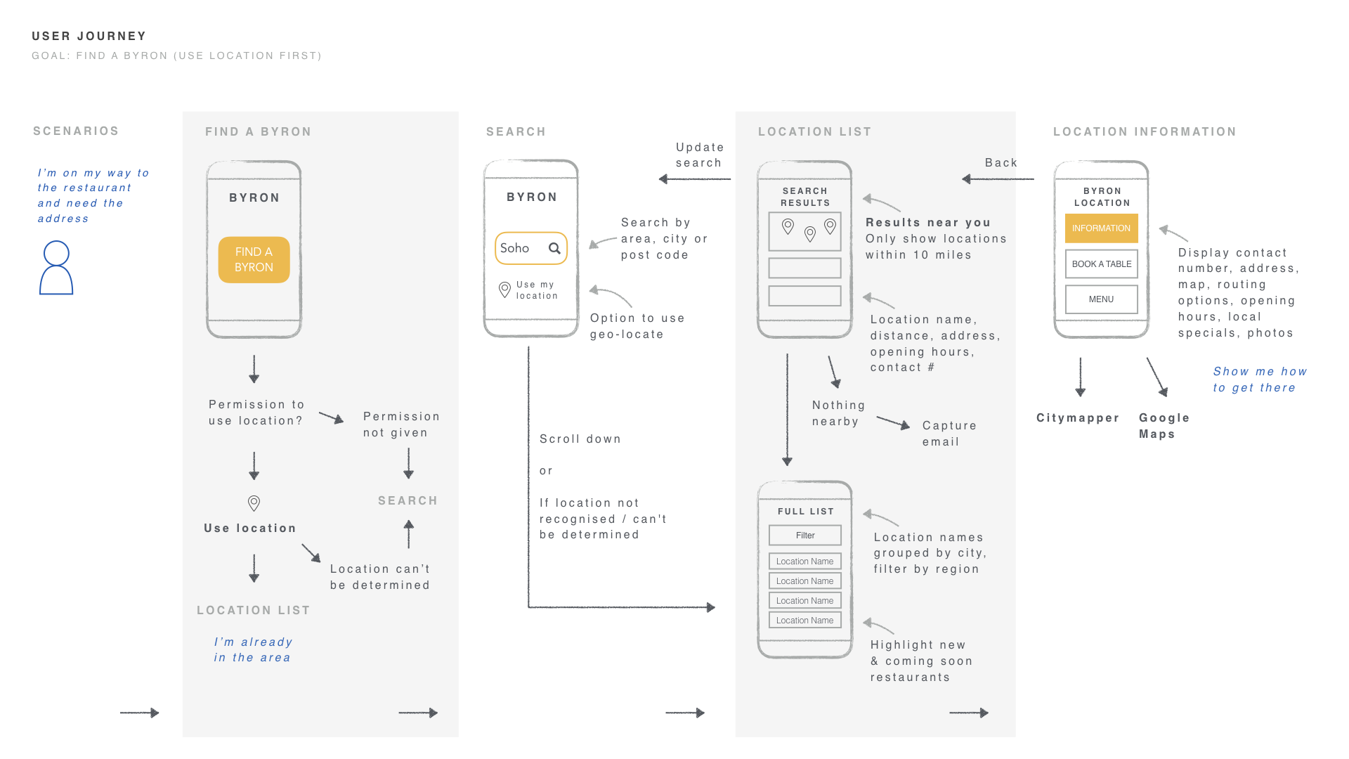
Detailed interactions for a particular scenario: finding a restaurant on a mobile using geolocation
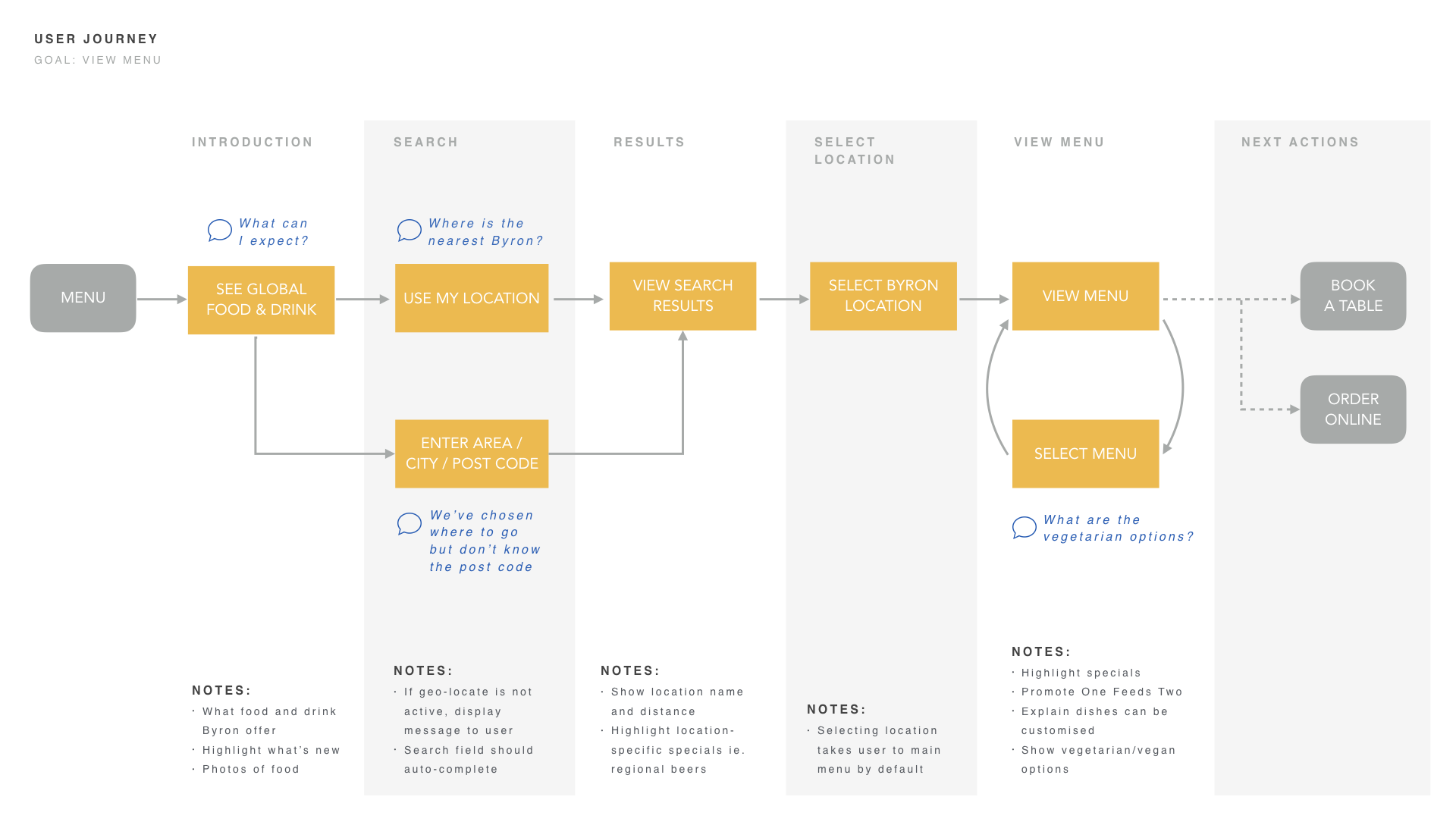
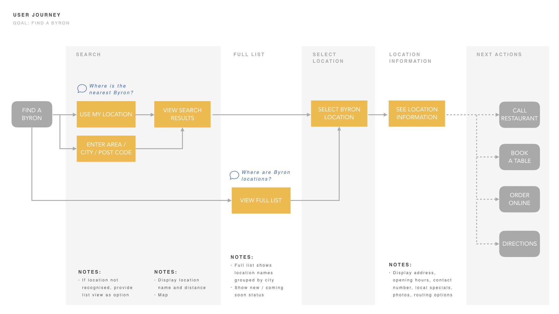
Information Architecture
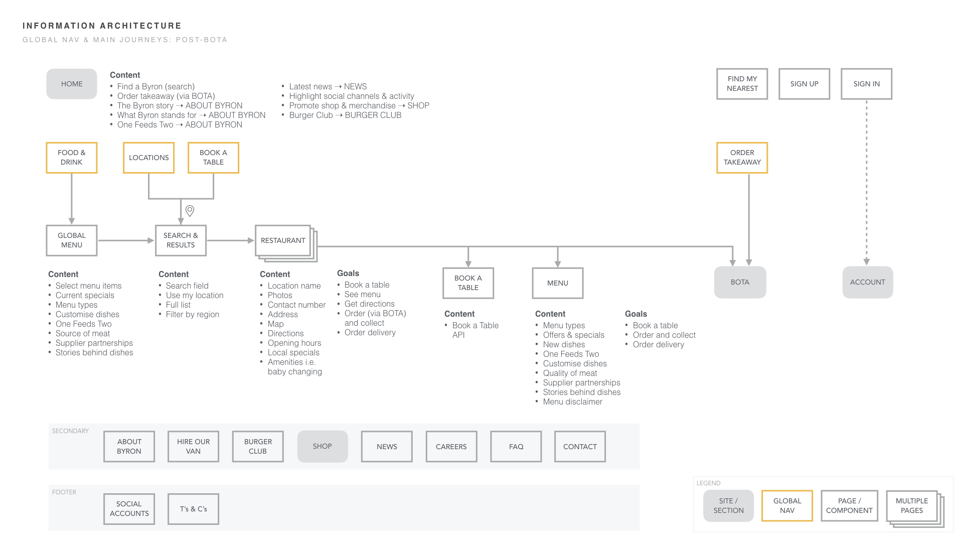
I designed a new site architecture and created two sitemaps, pre and post the integration of a new takeaway platform. I summarized the content requirements for each page/section based on agreed features and user stories.
Exploring Navigation Styles
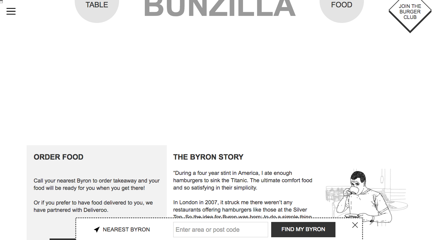
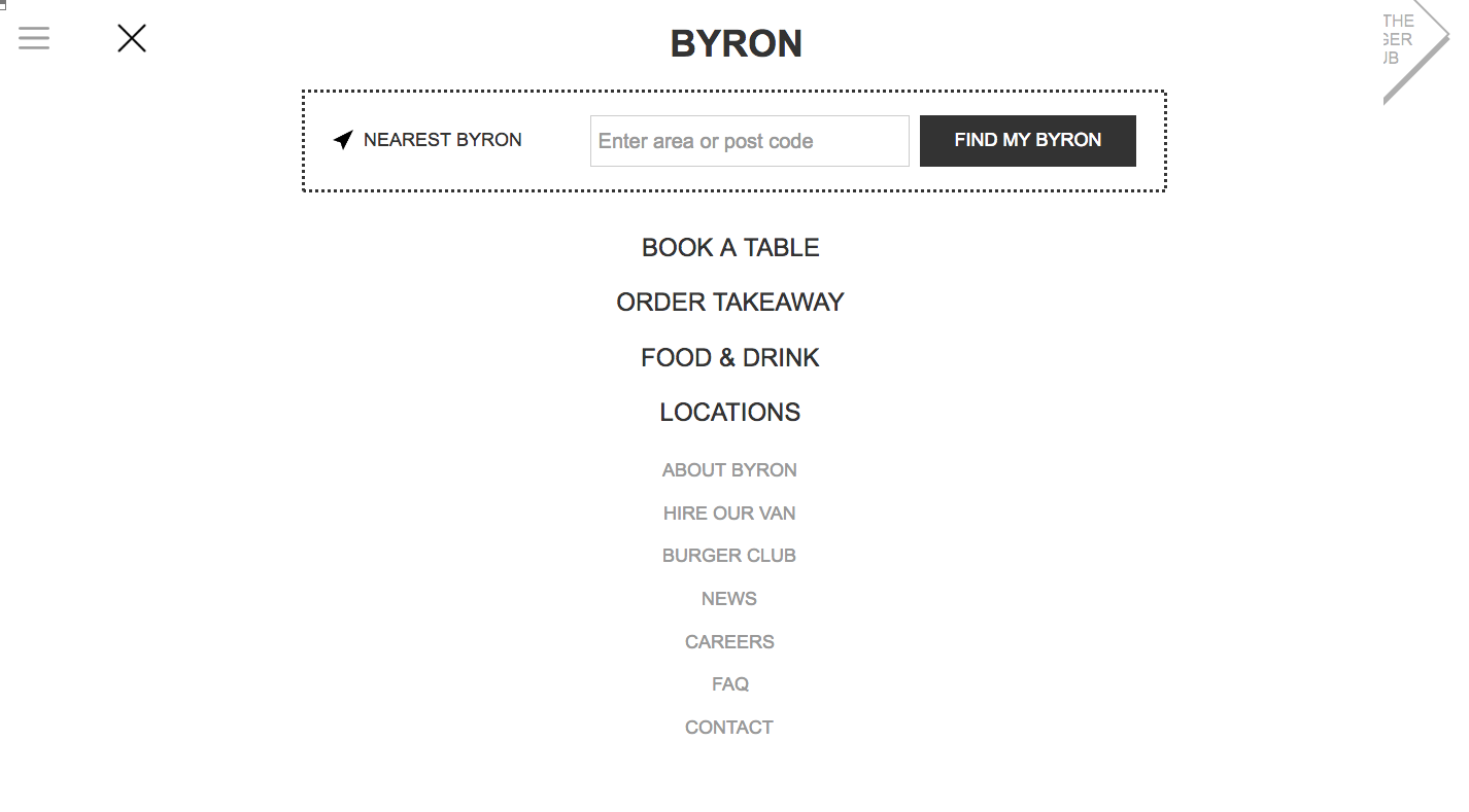
To explore various navigation styles and how each one might look/feel, I created interactive wireframes in Axure. Screenshots of the sticky top navbar:
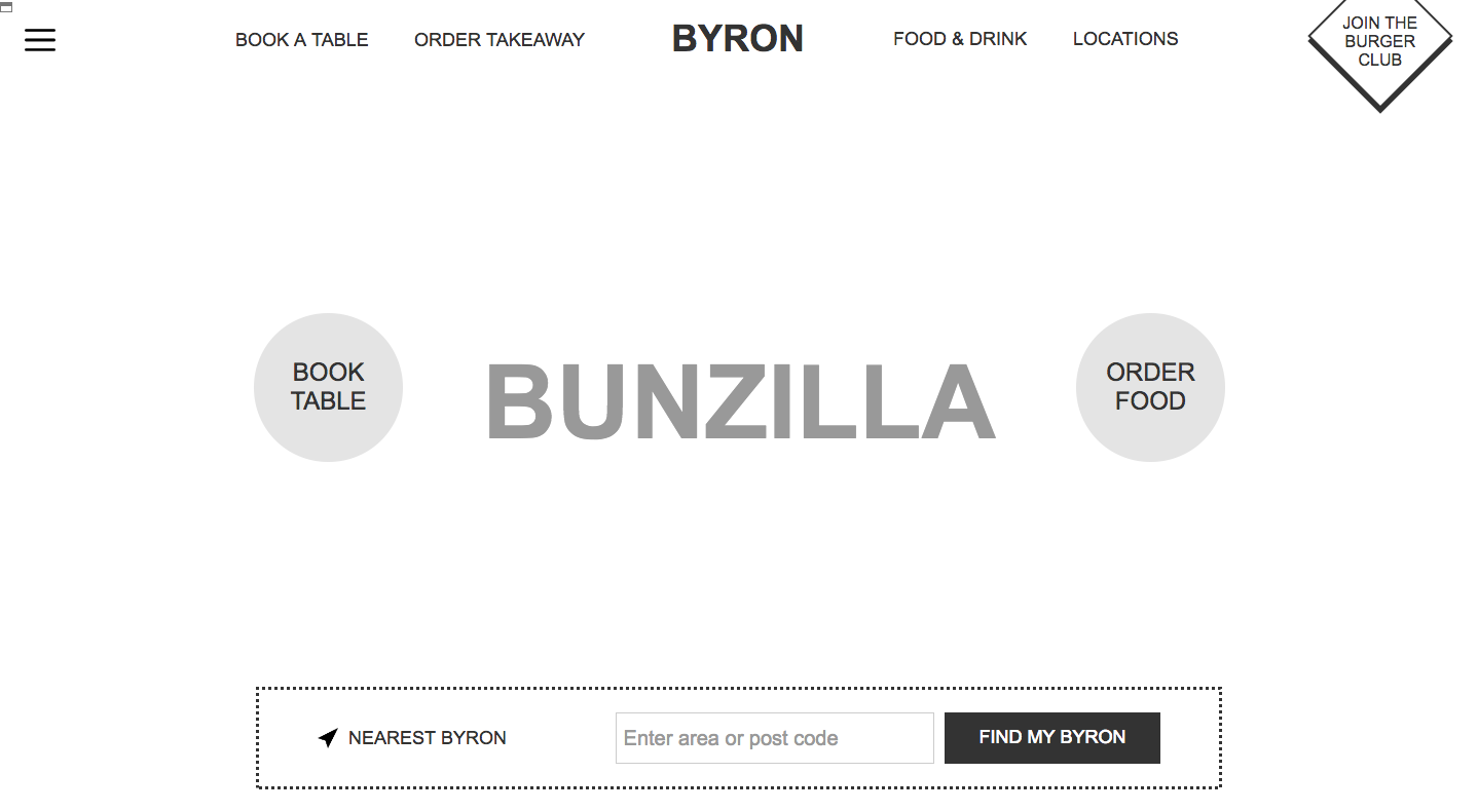
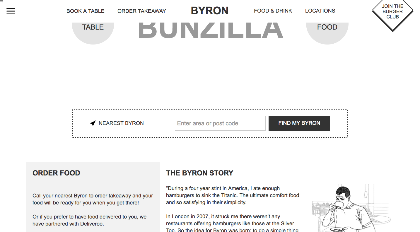
We experimented with having a sticky location bar at the bottom which would provide easy access on the phone for a user on the go. Also shown is the hamburger menu and hierarchy of pages.